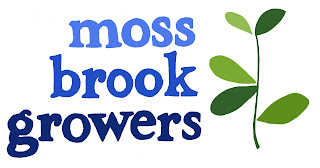
Last year I was privileged enough to have worked at Unicorn Grocery Workers' Cooperative in Manchester, UK. While I was there two members of the co-op were starting Moss Brook Growers, a farming cooperative which grows organic produce to sell locally. They needed a logo and that's where I came in! Actually, I had helped them out even before that, working on the land. I volunteered a few times, weeding, planting and harvesting! When they asked me to do the logo I was glad to have first hand experience with the business and that I knew what they were about.
They wanted a bold and simple design, with bright colors. I decided to stick with botanical imagery, something leafy. We came to this basic design quite quickly, but the colors went through several changes. My style tends to have muted colors, warmer tones of greens and blues. Their desire to brighten the color palette pushed me a bit out of my comfort zone, but I love the end result and it's just right for them.
After I moved to Los Angeles in September of last year, they asked me to create a font based on the typography in the logo. I hand drew the logo and so creating an alphabet meant hand drawing every letter, including capitals and numbers and punctuation! I had done that before for Cafe Verde, in 2008, but Moss Brook also wanted me to program it into a usable font, which I had no idea how to do!
It was a fun and challenging project which taught me a lot about how fonts work.
The Moss Brook Growers website is up and running, so you can find out more about this cool cooperative and see my font in action!


No comments:
Post a Comment